I grew up with old school D&D. I've still got the Holmes and Moldvay sets and all those first and, later, second edition rules. If you look through those books, you can see how the art became more sophisticated over the years. This trend continued, not just in D&D, but most games. Vampire, Teenage Mutant Ninja Turtles, Battletech, Warhammer, all of em delivered top notch, detailed art.
For some games this works really well. If a game has a specific setting that the art is supposed to convey or is based upon miniatures that you will play with, then this sort of clean art can be perfect. You can see this in Brom's work for Dark Sun and most of the Battletech art. But, as I got older and started buying collector's editions of computer games that came with art books, I found another style that I felt worked better, or at least much better for a project like Krendel.
When we sit around a table and engage in our games, we rely upon each other to describe the scenes, our characters, and their actions. Sometimes players even close their eyes to better visualize what is going on as the descriptions unfold. But, no matter what one person visualizes, it will be different from what everyone else visualizes. It seems so obvious when we say it. After all, we all think differently, we are only given a few details to work with, and we have to fill in the rest for ourselves.
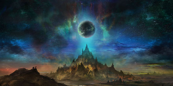
This brings me back to the art style I chose for Krendel: Concept Art. The covers and colored splash images are the most detailed pieces, but they really only have a few concrete details. They are much like the scenes the Game Master reads out from a text box in a module or when she takes the time to provide elaborate set up. Let's take the cover of Krendel Core as an example:
The sky opens to the night. A party has crested a hill and now has a full view of a lone, jagged mountain with a glowing orb reminiscent of another world spinning over it. Yellow glows illuminate sections of the mountain, outlining a myriad of spires. Smaller pointed structures populate the surrounding plains, and a river runs between the hill the party is on and mountain.
That's the sort of verbal description we might get at the table. Where that description perfectly fits the art, there's still a lot that we are left to fill in, like the placement and nature of the pointed structures, the presence of stars or clouds, what color the world is, the nature of the glows, and so forth. We fill those answers in ourselves or we ask questions of others to get them to fill in those gaps for us. Concept art works the same way. It invites you to start asking questions. What is the source of those glows? Why are there such jagged structures on plains? Are those buildings on the mountain or just wicked rock formations? Before you know it, you're drawn in.
The rest of Krendel's art, mostly black and white, is representative of more common descriptions we give at the table. The image here is one such example. It's a woman with a sword. That's it, and that's the extent of the detail we'll probably get at the table. Now, looking at the piece you can add in other details: she has an athletic build, shoulder blade length hair, clothes, and a nondescript face, but those details you could have just as easily added for yourself if all you'd heard at the table was "a woman with a sword."
So for me, concept art is more reflective of our shared adventures around the table. We're given a few details and then work up the rest for ourselves. The cleaner, more finished art is still fantastic, but it is someone else's fully fleshed out vision, not what you or I may visualize if given the same description.
Fortunately, I found an artist that understood what I wanted and delivered in spades. His name is Jeff Brown, and working with him was great. He was fluid, imaginative, and willing to take direction. When we first started, he had a bit of trepidation when it came to drawing people, but I kept pushing him. His vitruvian man (splash image for the chapter "Powers G-O" in Krendel Powers) was actually a very early piece in the series, and it came out great. I encourage you to check out his site.

